I was put in charge of the menu for my family’s Thanksgiving! This will hopefully become a tradition. I had a great time drawing, and the meal was delicious!
Peach Jam
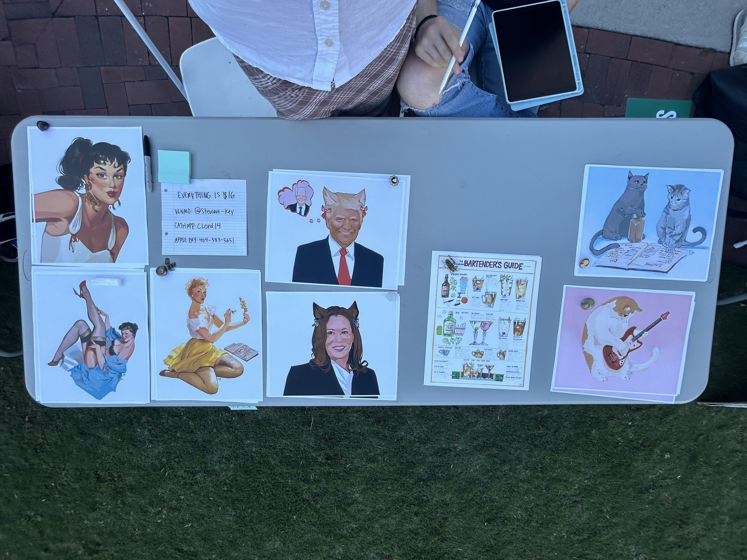
The Young Democrats of Emory asked me to be a vendor at the Peach Jam! I made about $200 and had a lovely time. I made a few prints of new digital drawings; the cat prints were a hit!
Trip to Italy
My family took a lovely trip to Italy and I did some painting! I spent a good few hours on this grape painting (and drank wine while I did it). I also painted a statue we saw in town.
I brought a tube of white gouache and a pallet of watercolor pots. Mixing the two lets me get gouache in whatever color. Much easier for travel.
Emory Art Market
March 19 Emory hosted an art market! I sold almost all my art and made about $200- absolutely a success. I hope to participate in more markets in the future!
The biggest hit was my bug portraits. For $7, I would draw people as bugs!
Senior Project
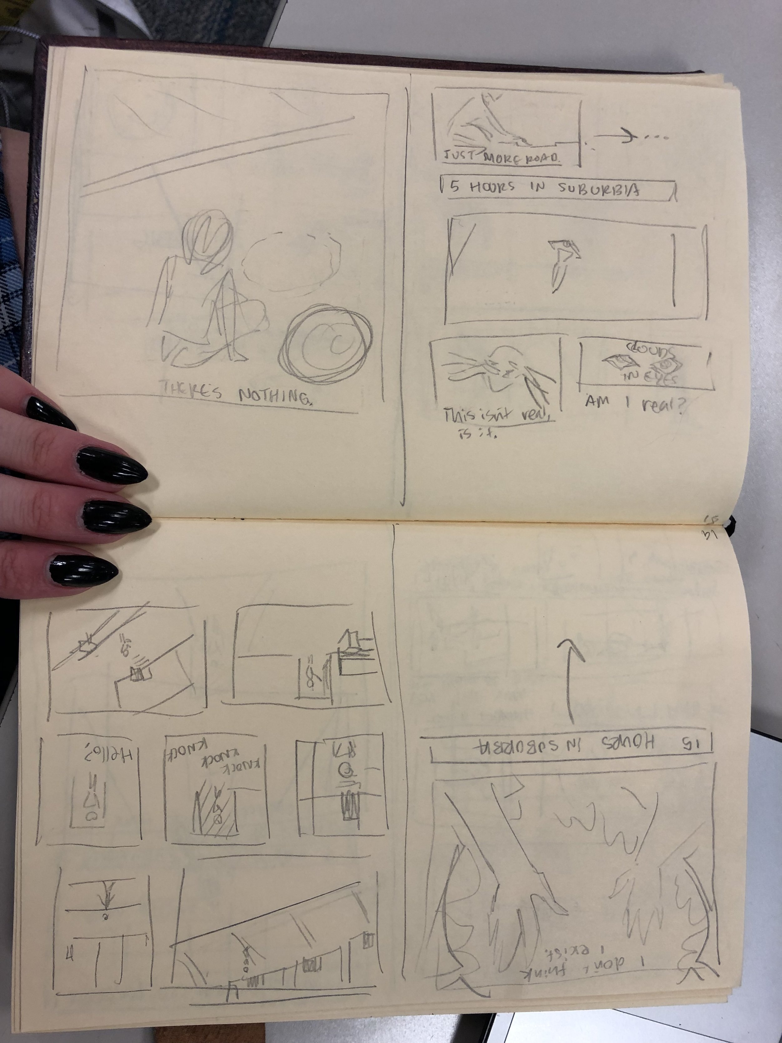
Senior year I took on an even more irresponsible project: writing my own horror manga. Of course, it isn’t an actual manga, but I took inspiration from my favorite horror manga artist Junji Ito so I figured I would title my project Horror Manga. Below is the website dedicated to the entire process of the project, including the final project.
More importantly, this site includes a google form for horror movie recommendations! Add any you have :)
Cocktail Party Takeaways
My English teacher is making a podcast and has asked me to make the cover for it! I ran through a few designs, shown below.
We ended up going with a simplified version of the design in the top right. The focus of the podcast is to run through the main takeaways from the books most people read in high school- takeaways that one could bring up at a cocktail party.
Living Lovett
Junior Year Dragons
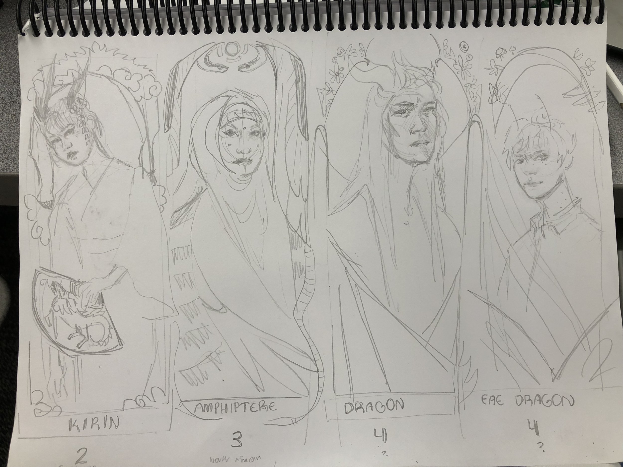
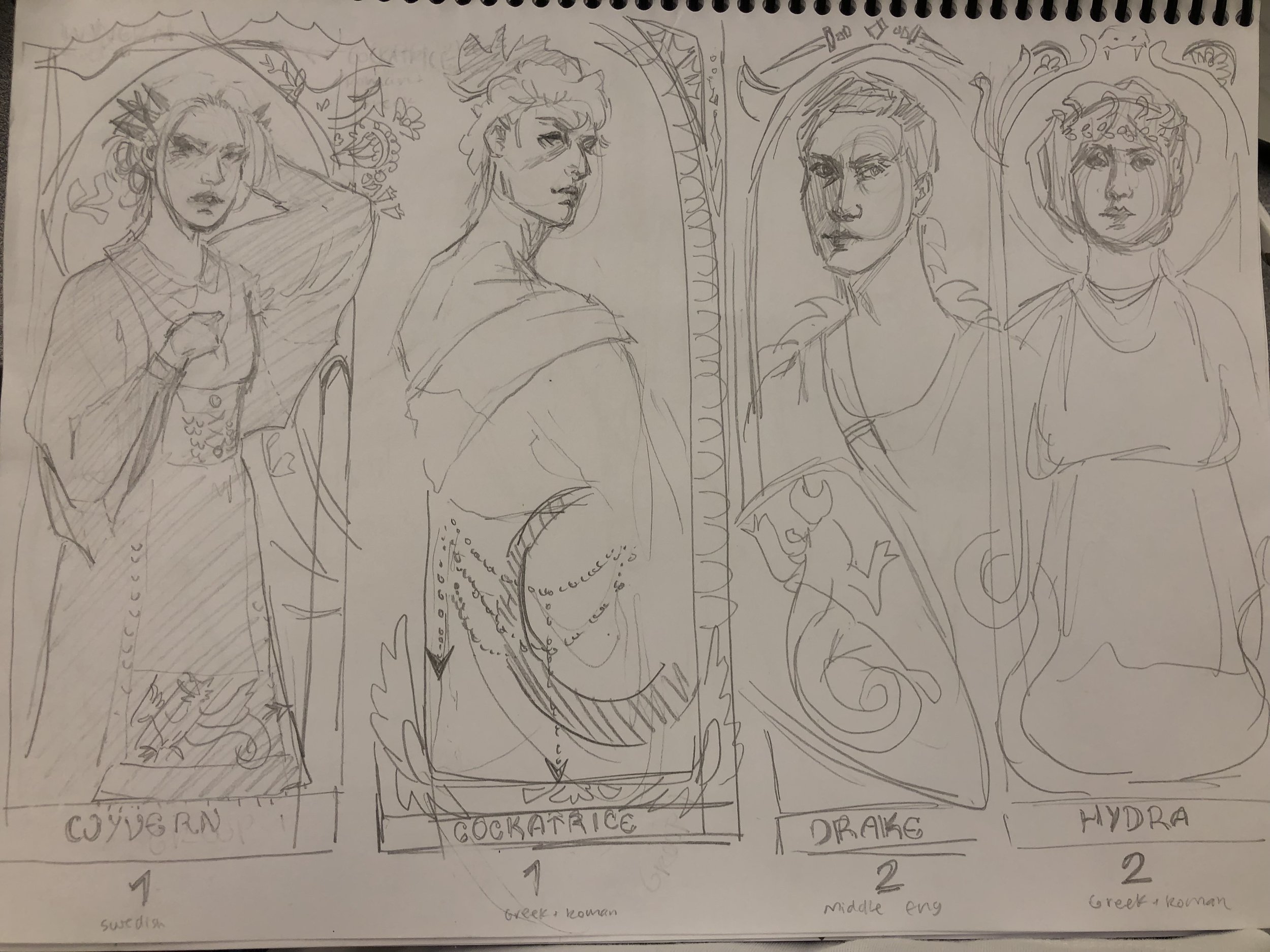
My junior year in high school I completely overestimated my free time and created the most over-the-top project ever. I decided to research every culture’s version of dragons and create a portrait dedicated to each. I, however, did not realize how many cultures had some sort of dragon (I ended up with 14). After hours and hours of research, MANY more hours of drawing, and a few more of framing, I finished this project. My dragons are now spread out between multiple family members’ houses.
Up close pictures of all 14 can be found under the ink / marker tab!
NASA Apollo's 50th Anniversary
On Saturday, July 20th, 2019, NASA celebrates the Apollo missions’ 50th anniversary. To celebrate, they held an art contest, which I entered in. The contest required me to use images taken on the Apollo missions.
To start this painting, I first decided what I wanted it to be. I decided I wanted it to be of a person because I enjoy drawing people the most. I looked through the NASA website to find inspiration and after finding an image of an astronaut floating in front of Earth, I decided I would use that as a base. As I sketched the basic layout of the painting, I came up with my plan: the painting would be a portrait of Neil Armstrong in a spacesuit with a dark background and the reflection of the moon on the helmet.
As I began painting, I set out the basic colors in blocks across the painting. I left white, grey, and blue blocks along the spacesuit, and peach and brown blocks along Neil’s face. These sections of color helped me to set up the basics of the highlights and shadows of the painting. This method is shown in the image above, mostly on the left side.
For the face, I used peach for the midtones, brown and black for the shadows, and a mix of peach and white for the highlights. I used a mixture of red and peach for the lighter shadows and to add a bit of blush. After laying out the basic color setup, I added details to the eyes, nose, and mouth. The picture shown above is an in-process picture once I finished the face and had the basic setup for the suit.
As I continued to add details to the suit, I decided to use gold on the left as highlights and silver on the right as midtones to help add to the otherworldly effect of the painting. I also added glitter in the brighter areas: the lights on each side of the helmet, the brightest parts of the left side, and the eyes.
Once I finished the suit and face, I worked on the background. After painting it all black, I used the technique shown in the video above to create the stars. I covered up the main part of the painting with paper towels and then, using a mixture of water and white paint, used my finger to flick the paint onto the paper. I also used a white pen to add more stars. I added stars in the background and on the inside of the helmet.
When it came to the reflection, I honestly had no clue what I was doing. I ended up creating a shadow over the face on the left side and painting the moon over this shadow.
Gala + Carnival
My art process is an absolute mess. Very rarely do I actually start with a plan on what I will be drawing. My go to thing to draw when I’m bored is a girl’s face, partially because I have a pretty good idea of what girls’ faces look like because I am a girl with a face. I always start with this base, and from there, I create either a color scheme or a separate image to base the drawing off of.
1) To start, I set up my usual sketch outline of a woman. I then lowered the opacity of the sketch and put a peachy-colored layer beneath it. Then I did my usual shading and highlighting: I used a purple color on a multiply layer for shadows and a light pink on an add layer for highlights.
2) Next, I realized that the shadows created around the bridge of the woman’s nose looked similar to the wings of a butterfly. So, I started drawing a butterfly over her eyes. In my mind, I was basing the drawing off of a bright green rainforest or jungle. As I continued drawing, I realized that I preferred a color range of more blues + purples instead of greens and yellows. This was when I began to set up my color scheme.
3) But once I got to this point, I decided to split off my original setup and my new idea. I finished up the red-orange portion (Gala) and then copied the layer and began working on part two (Carnival). On this separate layer, I messed with the colors, shadows, and highlights of the image using the “curves” option. Basically, I did my best to create the most chaotic mess of colors I could while still making it look like a person. I also used the butterfly I had originally sketched and redrew it into this new layer.
So, I started with a pink-themed portrait, added a green butterfly, and then split this one idea off into two different color schemes. This summarizes pretty well my whole art process. I let colors and ideas change as I go on, and this helps to create something that I really love, and not something that I feel I could’ve done better on.


